Well, would you look at that - after 24 days of bashing away at a keyboard (from multiple people!) 24 Days of Hackage comes to a close, after what I think has been a very successful month of blogging.
Of course, this has all been a subtle front for Christmas & Christmas Ltd., and now that the hard work is out of the way, the marketing department want results. A few little sentences here and there aren’t going to cut it either - they can hardly put those on their PowerPoint slides. No, the marketing department want pretty graphs. Today, we’ll try and keep the marketing folks happy and take a look at the Haskell Chart library.
Tim Docker’s Chart library began in 2006, and has come a long way since then - especially after being the focus of one of this year’s Google Summer of Code projects. Chart is, as the name suggests, a versatile charting library. It’s capable of producing bar charts, line charts, pie charts, stacked area graphs, and more. Today, I’d like to explore three graphs based on data from Reddit submissions:
Thankfully, the Chart library makes all of this a piece of pie (sorry, I almost made it 24 days without a pun!).
The first thing we need to do is define some data types to capture our data. The interesting data is: the library being blogged about, the amount up- and down-votes, and the amount of comments. This is easily captured in a data type:
data BlogPost = BlogPost { blogPostLibrary :: String
                         , blogPostUpvotes :: Int
                         , blogPostDownvotes :: Int
                         , blogPostComments :: Int
                         }
I’ve then collected all of the data as a blogPosts value - though there’s no reason I couldn’t use a Reddit API to fetch this data as part of my program. For the raw data, check out the code on Github.
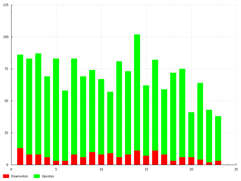
The first chart we need to do is a stacked bar chart. The Chart library has a PlotBars type of chart for this, and we can specify that the bars should stack. The general way to use the Chart library is by using the default values for most data types (available through def), and then customising various properties by using lenses. For our stacked area chart, we need to customise the style of the bars, the colouring of the bars, and also the data source for our chart.
upDownPerPost :: PlotBars Int Int
upDownPerPost =
  def & plot_bars_style .~ BarsStacked
      & plot_bars_item_styles .~
          [ (FillStyleSolid $ withOpacity (sRGB24 255 0 0) 100, Nothing)
          , (FillStyleSolid $ withOpacity (sRGB24 0 255 0) 100, Nothing)
          ]
      & plot_bars_titles .~ [ "Downvotes", "Upvotes" ]
      & plot_bars_values .~ dataPoints
 where
  dataPoints =
   zip [1..] $ map (sequence [blogPostDownvotes, blogPostUpvotes]) blogPosts
Rendering this to a PNG (using the Chart-cairo backend), we see the following graph:
It looks like there was almost universal love for every article - awesome!
I wonder if there was any correlation between the amount of up-votes and the amount of comments a submission received. For this, we use a PlotPoints chart, and we construct it in the much the same way - starting with a default value, and tweaking values with lenses:
upVotesAgainstComments :: PlotPoints Int Int
upVotesAgainstComments =
  def & plot_points_title .~ "Upvotes vs. Comments"
      & plot_points_values .~ dataPoints
      & plot_points_style .~ (def & point_radius .~ 3)
 where
  dataPoints = map (blogPostUpvotes &&& blogPostComments) blogPosts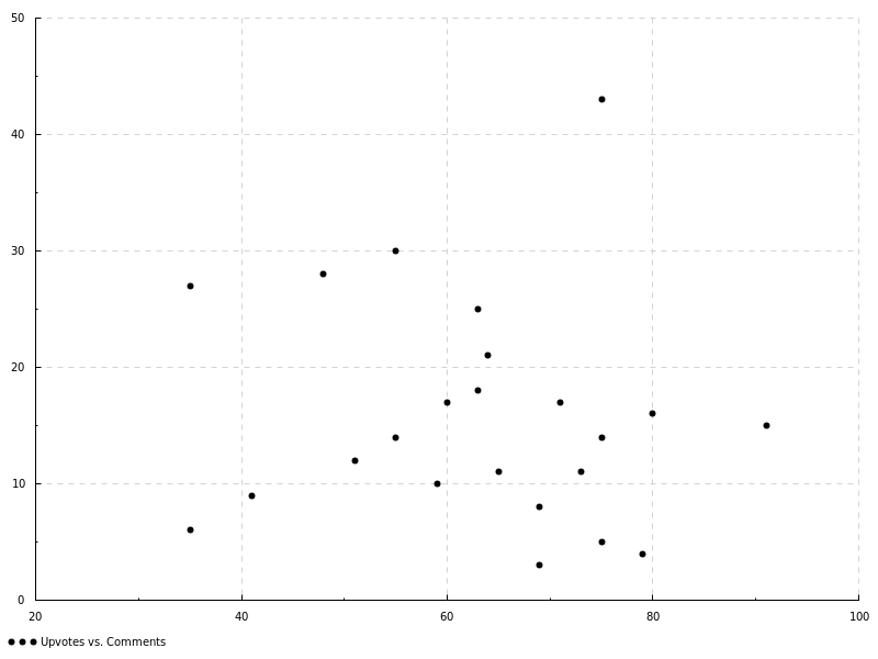
Hmm, it doesn’t look like strong correlation there. Better give that one off to the data scientists and see if they can find anything with some fancy regression methods, but it looks like the amount of up-votes doesn’t have much bearing on the amount of comments a post has.
Finally, lets see how up-votes were distributed over the entire month. We’ll use the loathed-by-scientists loved-by-marketing pie-chart for this. Yet again, we follow the pattern of starting with an empty chart, and adjusting properties to suit.
upVotePieChart :: PieChart
upVotePieChart =
  def & pie_data .~ dataPoints
 where
  dataPoints =
    let f post = def & pitem_label .~ (blogPostLibrary post)
                     & pitem_value .~ (fromIntegral $ blogPostUpvotes post))
    in map f blogPosts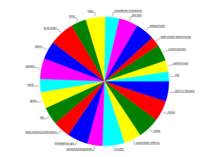
wow. such colourful.
It looks like every library received an equal share of attention - just as intended.
I’ve never used the Chart library before, but I was really impressed with just how little work it takes to get results! Usually, graphing things is something I despise, as it always takes hours of hacking data into some sort of CSV format, and then sacrificing small animals to the R gods until I can convince it to give me something usable. But with Chart, I just transform the data using regular Haskell functions (you can see above I use the reader monad and arrow functions). Furthermore, the types guide me into how to assemble the charts - I didn’t really read the documentation when I was working with this library, I just jumped in and fit the pieces together in the only way possible.
I want to send out a massive thank you to everyone who followed along this year. Your support has been tremendous and really helped me go that extra mile on every blog post. We didn’t quite manage to be error-free, but through your patience and attention to detail, I think we’ve patched up most of the posts. Hopefully these are going to continue to be useful, much like the posts from last year continue to be receive new traffic.
Whether or not you retweeted, commented, upvoted, donated Bitcoins or simply read the occasional post - thank you. I hope everyone has a relaxing end to the year and I’ll see you all in 2014 - when we can all make Haskell even more awesome!
You can contact me via email at ollie@ocharles.org.uk or tweet to me @acid2. I share almost all of my work at GitHub. This post is licensed under a Creative Commons Attribution-NonCommercial-NoDerivs 3.0 Unported License.


